


December Chat

What’s in month’s issue:
Folktale Week Overview
What brush are you using?
Christmas Card Printing
My First Ad
Custom Portraits
A Seasonal Wish
Behind the Scenes: Folktale Week
I am bad at documenting my art process. Many times, I’ve already got a solid idea before I start, which means there’s not as much planning or sketchbook type material. Folktale week was different since I wasn’t quite sure what I wanted. Originally, I had decided to sit this year out, but as I thought more and more about the prompt “fool” an idea came.
I didn’t want to draw a jester type character, but couldn’t break from that idea. Finally, it clicked and I realized I could start with the fool from tarot and then continue tarot for the entire week. I felt excited about that so I started doing some research to learn more about tarot.

I started with a little page of notes about each prompt and the card I thought they could line up with, if it didn’t already exist in the traditional tarot deck. I lined things up by finding qualities that matched between the tarot cards and the prompt list. These notes are also things I hoped my illustrations would embody when I made them.
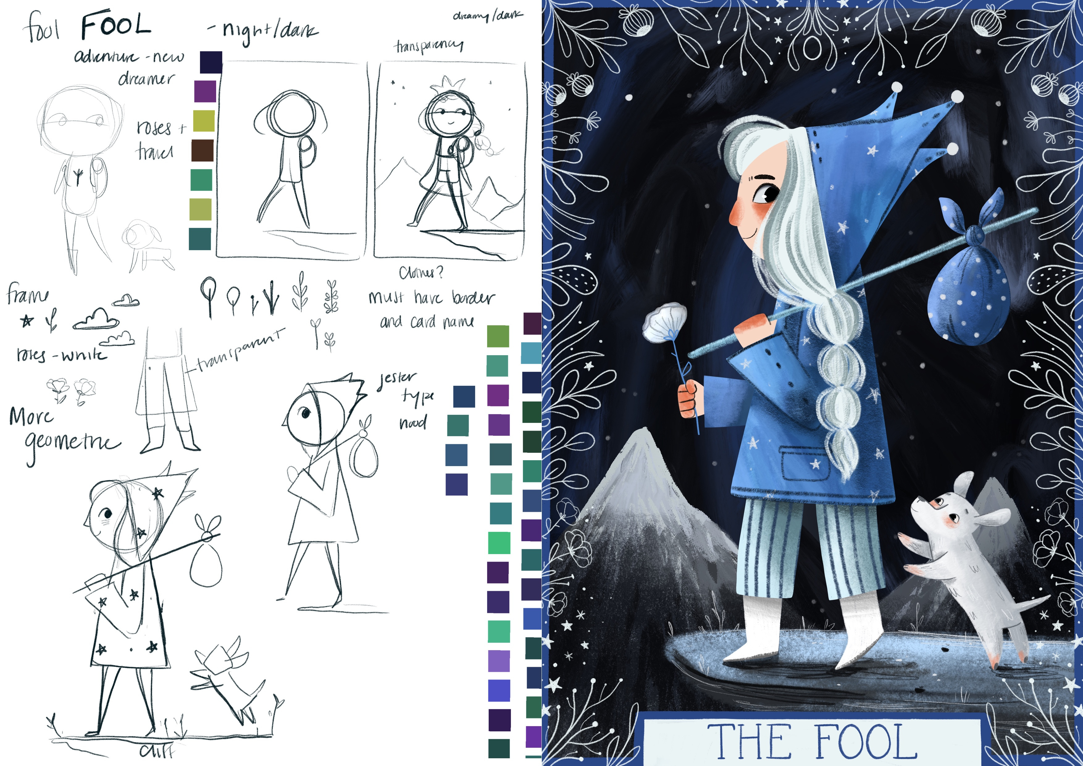
I stuck closely to the imagery on the fool card, but I wanted a darker more magical element to my version. I also found it interesting since a fool is usually seen as well…a fool, but when researching, it felt more like a risk taking adventurer to me. I started out disliking the fool prompt, but now really like it as a concept.
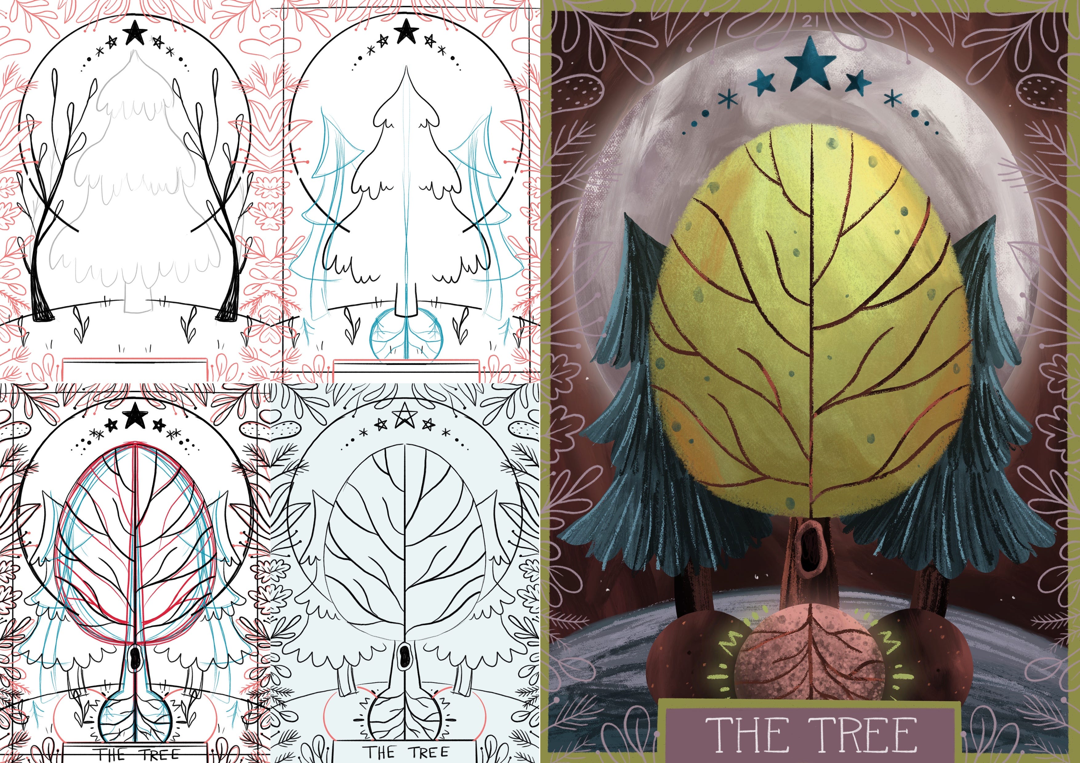
The tree card is a mashup between the prompts and the traditional “world” card. I struggled with how I wanted the tree to be. I was originally certain that it would be a pine, but as I worked and it felt like it wasn’t working, I switched and then things started clicking. The biggest issue at the start was the fear that a tree wouldn’t be exciting enough for a card and I needed some time to work out how it could look full and be clearly about a tree, but also not alone.
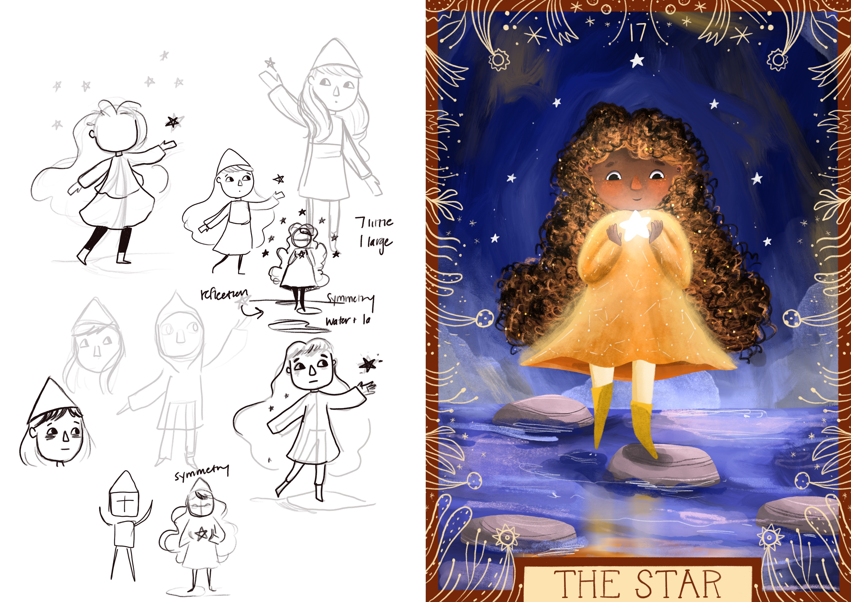
Star was easier since it’s a standard card. The main things I focused on when making it were a glowing sense of wonder and peace. I thought of a hat and outfit to have more of a pointed star look to the whole design, but I changed my mind as I worked through the sketches.

The rebel is combined with the traditional strength card. My biggest focus here was trying to create a lion that wasn’t too cute. I also played with the idea of choosing the chariot card instead of strength, but I liked the powerful feeling that came with having an imposing lion as part of the card.

This card is a mix of costume and seven of swords. I wanted the card to show dishonesty and deceit and hoped it would have a little bit of an unsettling feeling so went with a sickly neon color.
This is my least favorite of the cards. I kept struggling with thinking it looked a bit too much like Jason from the horror films. I also had a difficult time with the costume. I wanted it to be a bit spooky and have a skeleton feel, but slowly changed the overall look. I’m still not sure if I’m happy with it.
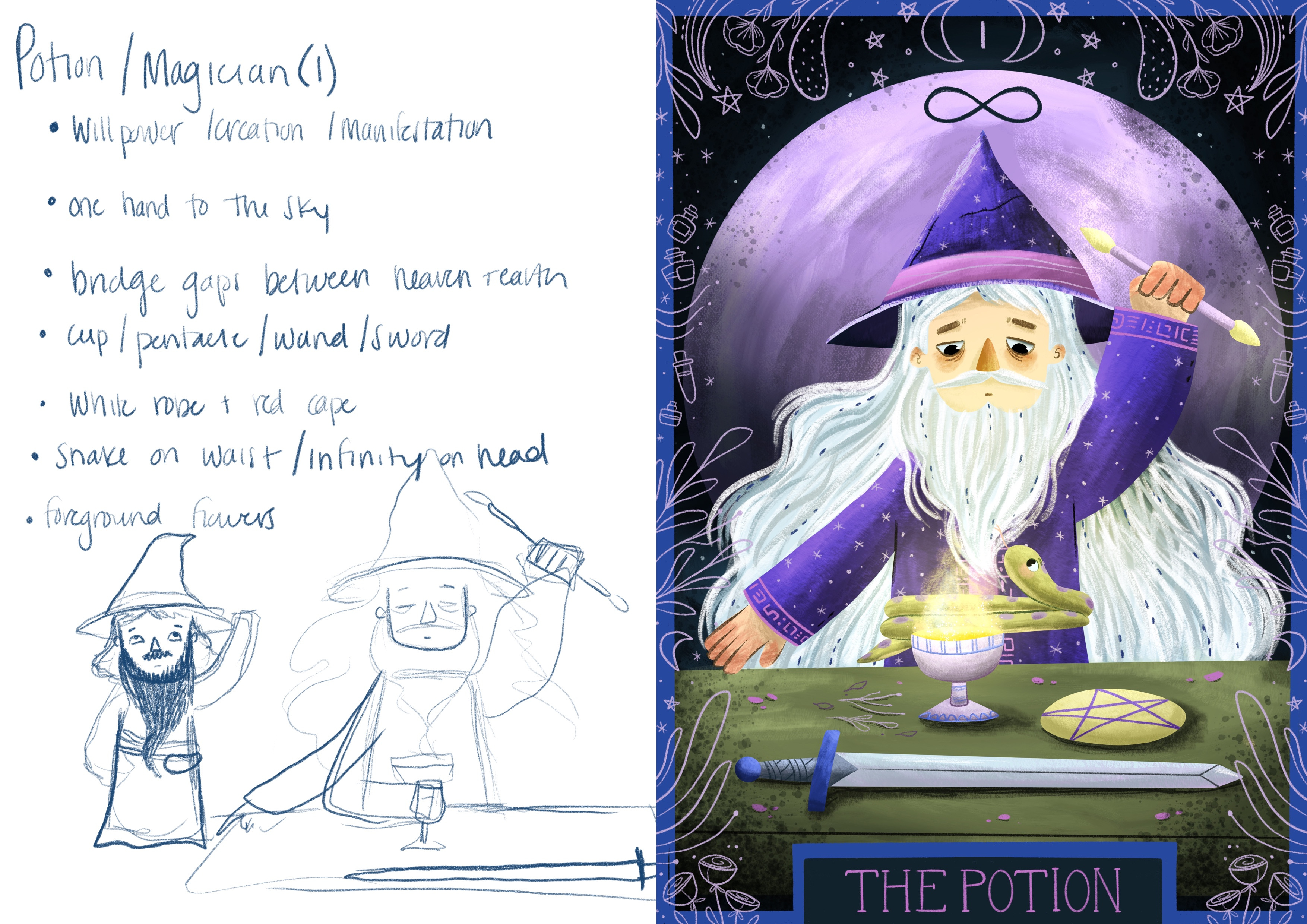
I stuck pretty closely to the magician card for this mashup between potion and magician. I tried to make the potion a little bit more prominent, but I liked having the magician take center stage. I’m not sure if I got the age right. He’s not the old wizened magician I imagined, but a bit younger.
I’d done a variety of color palettes and wanted to do something scaled back to end on. I’d debated throughout doing black and white with different pops of color for each card, but opted not to, but decided for the final card it might be fun.
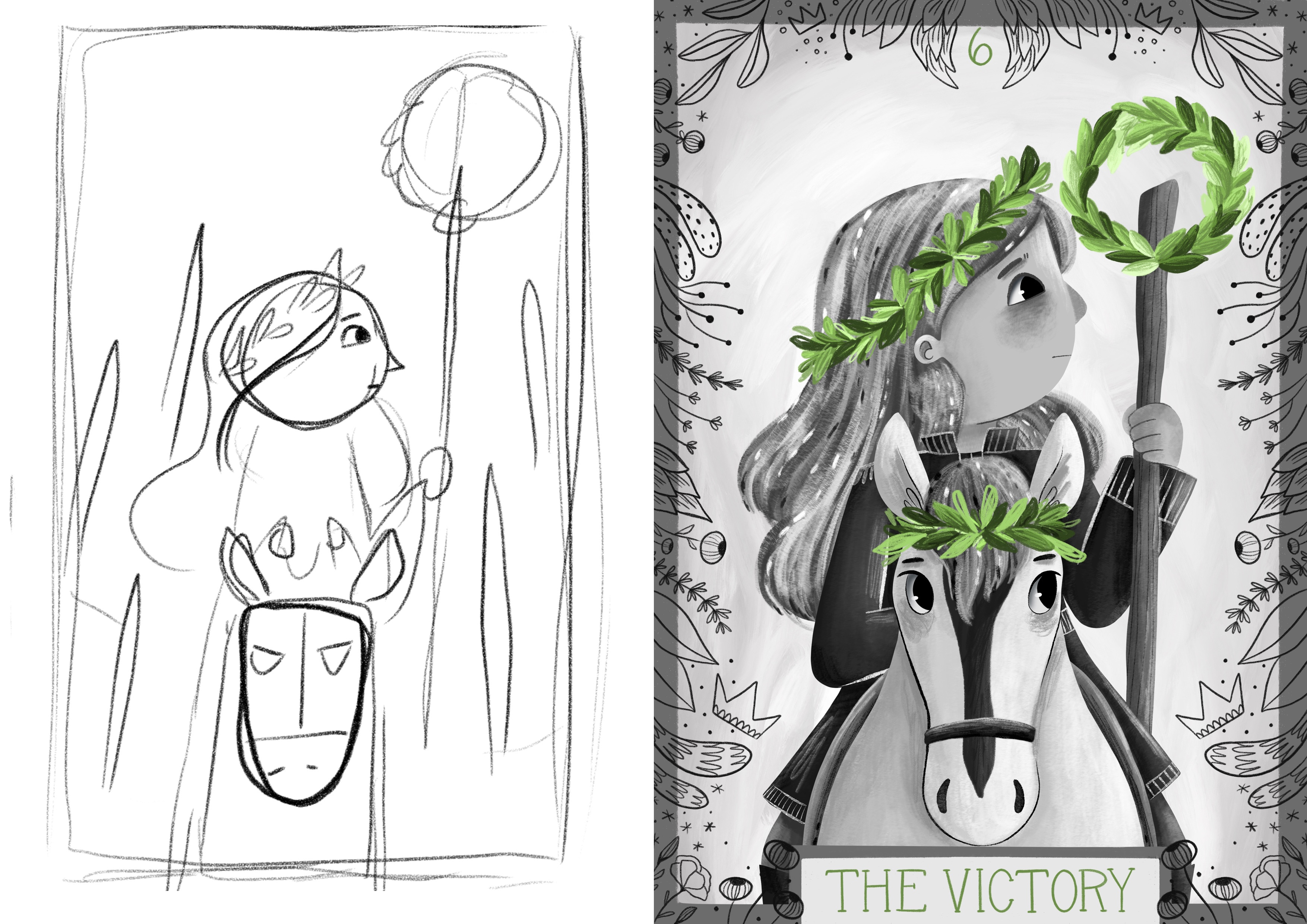
This card is a combination of six of wands and victory. I kicked myself for picking a card with a horse. I dislike drawing horses, but it fit the best so went forward with it. The only other big question on this one was if it should be a golden pop of color or green, but my nature loving side won out and I went with green.
Folktale week was fun, but intense. I do appreciate when the prompts come out early, but I seem to wait til the event starts before making much so it’s always a rush to get it done on time! I think with these challenges it’s great to participate if you can, but it’s also important to let yourself just let some pass you by too so it doesn’t become overwhelming. I’ll probably be done with challenges for a little while to rest up and focus on some work work.
The Question of Brushes
This is the most common question that I get and I also know it’s the most common question lots of other illustrators get. I always do my best to answer everyone’s questions because I come from a “learn how to art online” background, but the brush question, is my least favorite. I feel a little bad about disliking this question so much, but let me explain why I find it frustrating.
I don’t use consistent brushes: I go through little love affairs with certain brushes, but after a few months I’ll typically move on to something else. Why? I get bored. I’m fickle, my style is evolving! I can’t just pick a brush and use it forever and ever. Plus, using new brushes in new ways is one of the things that makes making art fun for me. I love the experimentation and challenge of trying to do new things and that means lots of brushes.
Everyone uses brushes differently: Similar to doing a dtiys where your fingerprints will be all over the work, the way someone uses a brush will be all over their work. I think this is amazing that one single brush could come out so many different ways, perhaps the person has made slight tweaks to it, maybe they have changed the opacity, maybe they use it for a specific texture, perhaps they’ve just changed the size. All these little user quirks will change how a brush comes out looking. Asking what brush I use, feels like an assumption that it’ll bring the same results for someone else, but I don’t find this to be the case.
It feels like people are looking for a shortcut: Maybe it’s not! I could be wrong, but sometimes I feel like there’s a thought that if you just find that perfect brush, suddenly the work will be amazing. If you put in the practice, any brush can look amazing. I think practice helps with knowing what kinds of brushes might do a good job for you too. It truly is a process of trying things out, seeing how they work and making decisions about how that brush might look cool in your work.

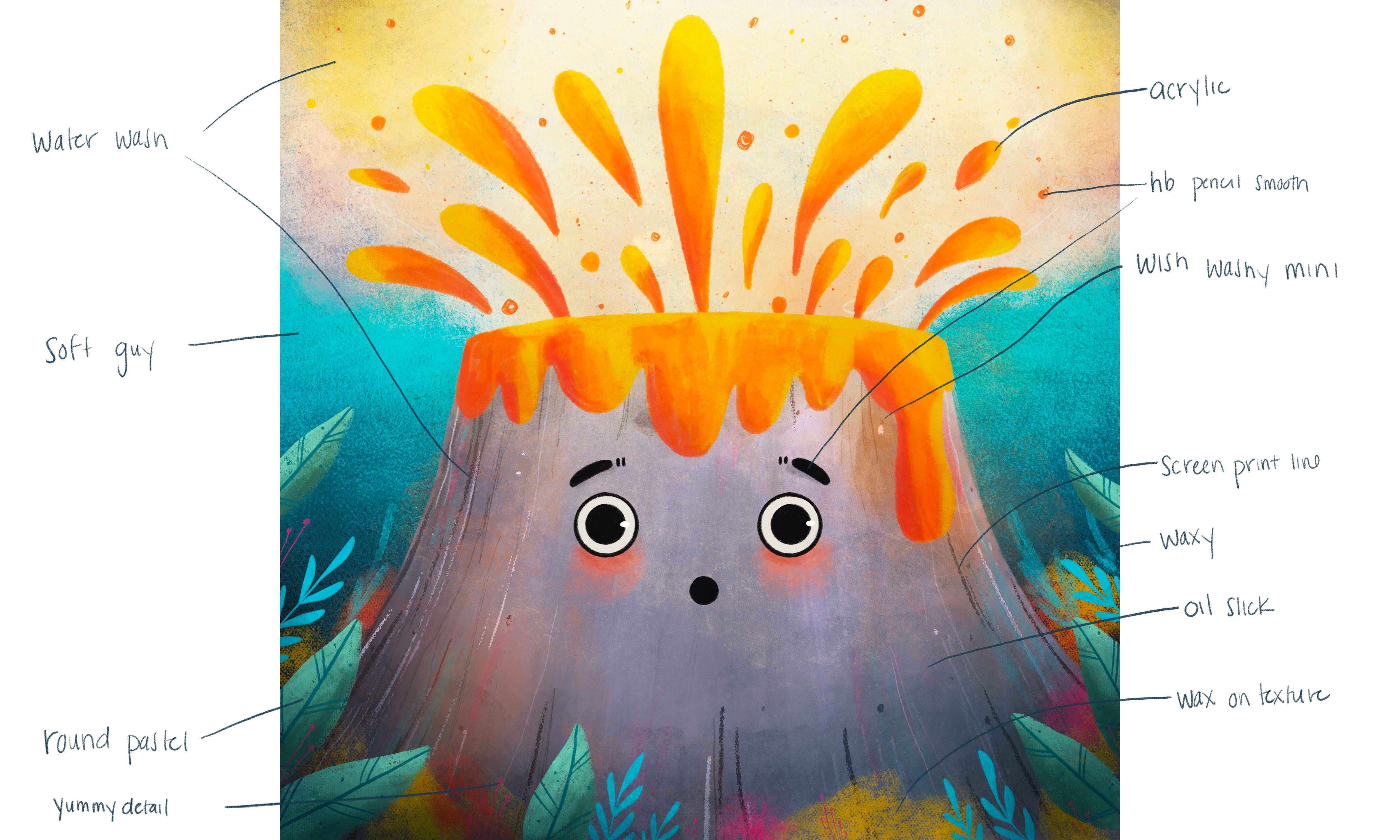
Because I can hear some of you saying, but Megan I want to know what brushes you use! I understand your points, but I still NEED to know. Well, currently these are my favorite brushes, but I’m only giving in because you asked so nicely!
Wax on texture, Waxy, Screen Print Line, Screen Print Fill, Soft Guy, HB Pencil Smooth, Wet Chalk, Charcoal Smooth, Water + Ink, Water Wash, Ink Brush, Kids Paint Brush, Wish Washy Mini, Yummy Detail, Acrylic, Oil Slick
Now, because I don’t want to miss an opportunity to talk up my art pals. All of the brushes that I use are created by Lucy Fleming or come standard in Procreate. I’ve used lots of brushes from other creators in the past too, but for the moment, these are what I use because there is a large variety of textures and in addition to that, there are some textures and brushes I am uncomfortable with using, which means lots of experimentation as I figure out how they might work for me.
One last thing about brushes, I do think it’s important that people kind of find their own way with their brushes because it ties in with style. How a brush is used is going to be unique to you and it’s going to show up in your style at the end. And I think we can all agree we want to do our own things and not draw exactly like someone else.
I hope this has inspired you to put your experiment hat on!
Card Printing
I’m not sending Christmas cards this year for a variety of reasons, but mostly because it’s been a hard few months here and I don’t feel up to celebrating like I usually might. But I do know some of you might be thinking of printing cards this year so I’ll share what I like to do when I do make holiday cards.
I usually pull a few wintery designs that I’ve made through November. Usually, I have planned ahead a tiny bit by making some wintery art throughout November. If I haven’t, I’ll go back to January and pull some art that is wintery, but that was made too late to make last year’s batch of cards.

I use Moo to do my card printing. Here’s me talking about my cards last year. I’ve been happy with their quality and I can do as many designs as I want in a single pack of cards. This is great for the indecisive person who can’t commit to just one or two designs each year. I also prefer to send postcards over foldable cards. This is for three reasons: I get more bang for my buck with a postcard, they can double as tiny prints and I don’t like the paper on the foldable cards. I buy my own packet of generic envelopes, usually in a color and just mail my postcards that way. I usually order 100 cards, that’s because inevitably people want more than one so it’s good to have a few extras.
If I am getting a standard moo postcard, my favorite option is: standard, original, front coated only, matte finish
For the past two years, I’ve gotten extra snazzy and have started sending pearlescent cards. The only downside with these is that they are technically flyers and don’t have writable backs. I have gotten around this by using a permanent marker or pen, but know that this is a flaw to the shiny pearlescent option. Do be careful because they have an EU, UK and US site from what I can tell so make sure you’re on the right one for your location.
My set up for the pearlescent card is flyer, pearlescent paper, small.
Also, if you’ve never used Moo before get their discount and if you have, in years past they’ve been good about sending out little discounts. I always use one of those because: savings!
And lastly, I just want to mention that I am in no way sponsored by Moo. I’ve just been pleased with their cards and thought you might like to know how I put my cards together.
My First Ad
I mentioned last month that I had partnered with OhhDeer as a brand ambassador. I made my first ad for part of their 12 Days of Christmas sale. I have absolutely no idea what I’m doing and I feel kind of awkward posting sponsored content on my Instagram. However, I had a lot of fun making silly ads. I have no idea if they are the right kind of thing, but I had a lot of fun making them and I guess that’s partially the point!


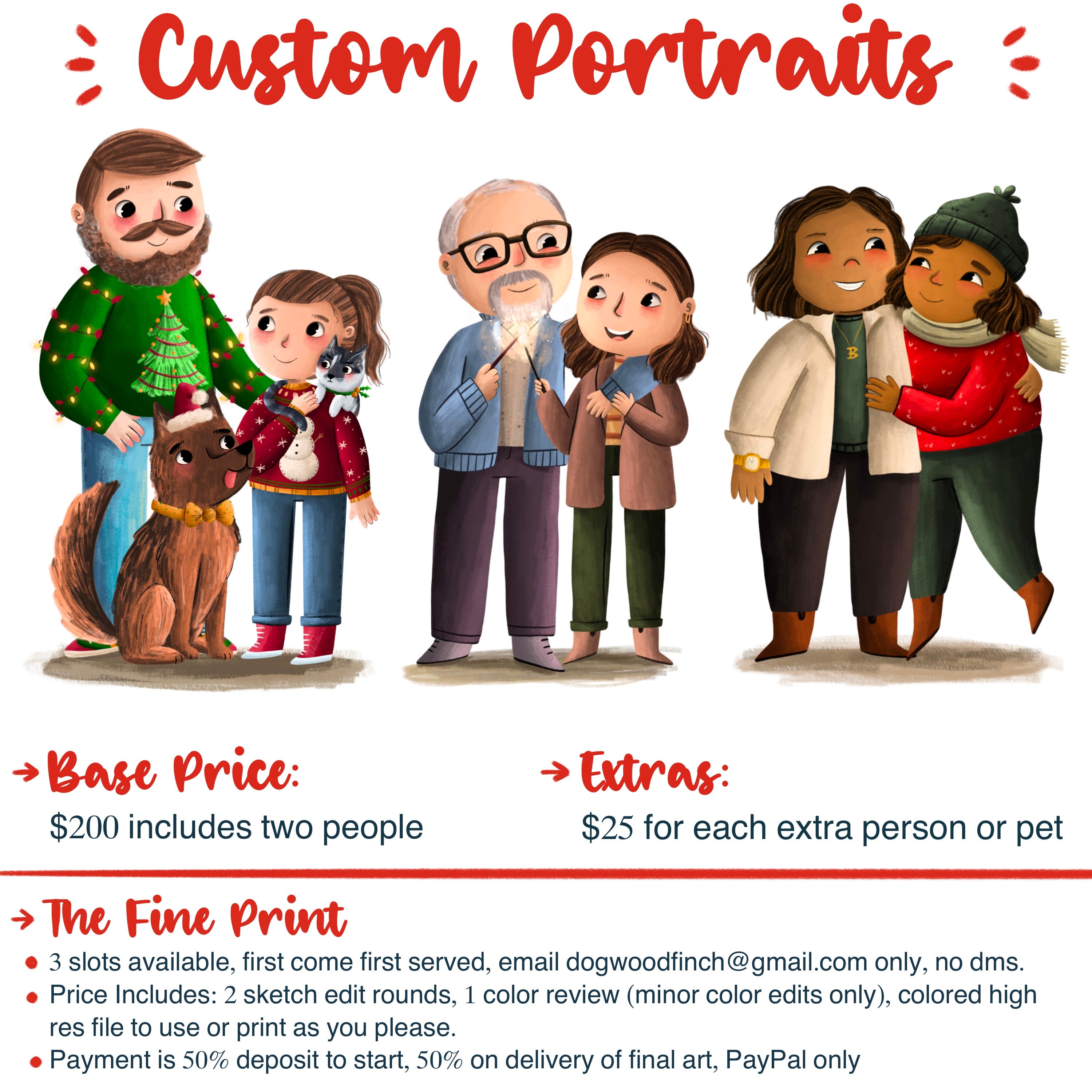
Custom Portraits
I also decided to offer custom portraits for the first time ever. I’ve always said no in the past to requests because I didn’t think I was good at capturing likenesses, but after doing several commissions for friends, I realized I could. I struggled with pricing because I know it’s high for people, but when I really thought about it, I knew I needed to price fairly because it helps other artists price higher rather than undercutting themselves and because my time is worth something. It was really hard to do though and I’m sure I had some people pass because the price was too high for them.
A Seasonal Wish
I hope you all have a restful season. This time of year, I love to take some time to watch, listen and try things I normally wouldn’t try. Consume all the things! I think of it as a way to fill up for the new year by breaking from my usual comfort go tos and habits. Whatever you do this season, I hope it brings you joy!